Guided by a Duck Rikaitched!
What you see above is the result of Mr. Scaryduck, Sir's instructions. Rik's w00t! graphix skillz.
The picture looked as I wanted it to in Ph*toBuck*t, as it displayed in a recent post.
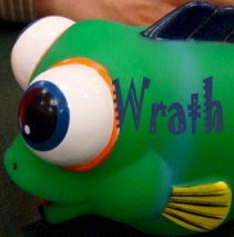
Above is what it looks like But when I inserted it, exactly as directed, into the Bl*gger template it went wonky. The width was correct, but it was too shallow. Not that Ricardipus' arm doesn't make a lovely header all by itself, but I did so want the balancing fish to appear as well. You try listening to fish blubber all night because they're not in the header and you promised them!
Any more bright ideas, But thanks for trying to help me, Feather Face. You just underestimated the degree of assistance (read: do it all for me, plz) I required.
*ducks*
The picture looked as I wanted it to in Ph*toBuck*t, as it displayed in a recent post.
*ducks*
 The Wrath of Dawn


5 Comments:
what did he do to your header ?
"Too shallow"
No comment.
I done nothing.
Ms Dawson just cannot follow instructions.
That is all.
Ow! My arm, it's off!
I blame the Duck.
That is all.
I'd do it all for you, Mrs.
Post a Comment
<< Home